The following is a virtual tour of AppComposer ... a walk-about of the screenshots
with explanatory details of the pieces.
AppComposer is made up of a few subwindows and panels. But before we
show them individually, let's show you the full AppComposer window first.
Each of the following thumbnails show how AppComposer looks under different
platforms. Of course, the first thing that a Mac user will notice is
that
the menu bar is embedding inside the window ... sorry about
that, hopefully we can fix that cosmetic issue soon.
Project Window
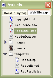 In the upper-left corner of the AppComposer window is the Projects
subwindow. A "project" contains all of the files that make up
your application, and in the case of a web application, can then be deployed
as a WAR to your application server.
In the upper-left corner of the AppComposer window is the Projects
subwindow. A "project" contains all of the files that make up
your application, and in the case of a web application, can then be deployed
as a WAR to your application server.
You can have multiple projects open at one time as in this screenshot,
with each project occupying a tab at the top of the window. If you have
more projeccts open than can fit in the tabs, you are presented with a
pulldown menu of the projects that do not fit in the available tabs.
Now is probably a great time to mention that all of the subwindows (like
any good app) can be resized according to your preference (and it remembers
these settings each time you restart AppComposer.
 Palette Window
Positioned below the Project window is the Palette. This window
contains a listing of all of the components installed
in your AppComposer installation.
Components are the building block for applications within AppComposer.
These "little programs" can be used to build your applications ... and
then can be reused for the next application you need to build.
Simply clicking on a component adds it to your current program where
you can then hook it together to other components with smart wires (we
call them behaviors). Once you are done with your program, you can save
it (or deploy it) and all the components (with their state) gets embedded
with it.
Components and Java Beans are usually organized
into packages. These packages form
the organizational structure of this window making it easier to find
the component
you are looking for.
Outline View
The center of the AppComposer environment is the "view" where the internal
or external representation of your program is displayed. When doing applets,
visually-oriented applications or multimedia-type programs, your "view"
is usually the Toybox View where your components actually
work while you wire them together.
Another view that is more useful for non-visual applications and web applications
uses the Outline View. In this view, each component and
behavior (our "smart wires") has a position in a hierarchy (see below).
Blue arrows represents events that stimulate the behaviors and red arrows
indicate an action sent to some component.
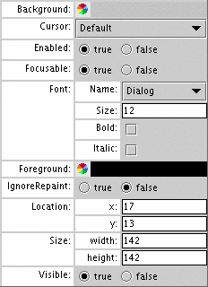 Property Sheet Property Sheet
On the right side of the AppComposer environment is the property sheet where you can
adjust the properties of individual components and configure the stimulus and actions of the behaviors.
Component-specific properties are displayed with fields allowing the user
to change the current state of the component. These include everything
from the component instance's name to selecting its background color.
And specialized editors can be used to configure the property.
For instance, you don't need to remember color codes for the background
as you can just click on the desired color in a color wheel popup.
Some components can get rather involved in editing their properties, so
these components can actually start up small windows to allow the user
to configure the component.
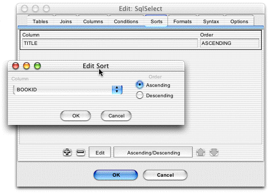
One of the best examples of this is the components
in our SQL Beans collection, which contains a few components
for selecting, updating and inserting information into a database (see
the screenshot below).The SQLSelect component allows the user to build
complex database queries by simply editing fields in a popup window
making it easy to make database queries ... no SQL required.
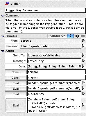 Behavior Properties
When a behavior is selected (instead of a component), its properties are
displayed in the property sheet. A behavior is made up of one or
more stimulus and
an action. The properties panel demonstrates this.
The stimulus section shows the component and the event that triggers the
behavior. In the screenshot on the left, you'll notice that the triggering
component is the capsule container itself, and the event is generated
when it starts up.
The action section shows the event that this behavior sends to some component.
In this the example on the left, the component is a "License Key"
component that accesses a web service, and the message is actually
a method call on that component, getVARkey.
In this example, the method takes six parameters, so six fields show us
allowing the user to fill in the values for these parameters. Note
that the fields can either be constant values (Const) or regular
Java descriptions (Eval). Normally these are simply method calls
or the value from variables, but this doesn't stop you from typing
any Java expression as the last field demonstrates ... granted,
that is probably a poor example of what you should do.
|
 Site Map


